I’ll show you how I frame, capture and check tricky text so a menu or sign is easier to translate on the spot.
Mateo IrvingReviewer · published Oct 31, 2026 · 6 min read
01Start with one menu item, not the whole board
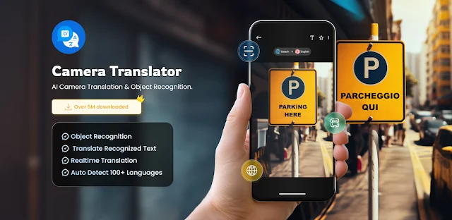
A crowded menu, steam curling off the plate beside it, is exactly when I resist pointing at the entire page. Camera Translator uses the phone camera to recognize text and overlay a translation; a packed frame gives the text recognition more to sort through. I move close enough to fill the view with one dish name and its description, while keeping the letters inside the camera frame.
This pays off with narrow columns, decorative fonts and menus photographed behind glass. Translate a section at a time, then move to the next. If I’m choosing food for a group after practice, I capture the dish name and nearby description together so the translation keeps some context. A tighter frame is a better starting point than repeatedly tapping at a page full of tiny text.
02Tilt the phone to tame glare before capture
A ceiling light reflected across a laminated menu can erase a few letters without making the rest look obviously blurry. I shift my position or tilt the phone slightly until the bright reflection moves off the words, then hold the camera square to the page. If I tilt the page instead, I watch for perspective distortion: letters near the far edge can become harder to read.
Try this before blaming the translation when a label or sign has glossy coating. It also helps with product packaging under shop lights. I avoid using digital zoom as my first fix; moving closer usually keeps the characters more legible. Once the text is evenly lit and the words are in focus, capture it and check the overlay.
For a moving scene—say, a station sign seen through a bus window—I take a photo rather than trying to keep the live view steady. Camera Translator lists photo translation alongside camera translation, so a captured image is a useful route when I need to inspect the words at my own pace. I steady the phone, capture the sign when it is fully visible, and work from that image.
This is especially useful if the sign is high up or I only get a short clear view. Keep the full line in frame, including nearby arrows or headings that may help explain what the words refer to. A photo also gives me a moment to zoom in on the original lettering and compare it with the translation, instead of making a decision while the scene is passing.
04Let language detection take the first pass
When I’m facing a label in a language I can’t identify, I start with automatic detection rather than guessing a source language. The app describes automatic detection for text in images, which can save a fiddly selection step when a trip crosses language boundaries. I still check that the target language is the one I want before relying on the result; recognizing the source and choosing the destination are separate jobs.
This habit helps with packaging that mixes languages or a sign with unfamiliar lettering. If the result looks scrambled, recapture a cleaner, tighter image before changing several settings at once. A half-hidden word, glare or very small print can confuse recognition regardless of the language. Fix the image first, then see whether the detected text and translation become more sensible.
05Switch to object recognition only for a name
A picture of a fruit, tool or unfamiliar item is a different problem from a paragraph of printed text. Camera Translator has an object recognition mode that identifies an object and translates its name. I use that when I want a basic label for something I’m looking at, not when I need instructions, ingredients or a full description from its packaging.
This distinction matters in a shop or market. Pointing at the object can help with a quick name; pointing at the printed label is the better choice for written details. If several objects are crowded together, isolate one in the frame so the result has a clear subject. Treat the translated name as a clue to what the item is, then use the text mode for any wording that needs closer attention.
06Check the original before acting on a short translation
A single translated word can be easy to misread without its neighbours. Before following a direction or choosing a product, compare the overlay with the original text and include a nearby heading or symbol in your next capture if it changes the meaning. For a sign, keep its arrow in view; for a package, include the line around the word rather than cropping to a lone label.
I use this extra check when a small distinction matters to the choice I’m making. It is also sensible when the image is blurry, the text is curved around a container or the design uses unusually small lettering. Camera translation makes a quick first read convenient, but a clean frame and a little context make that read more useful.
The takeaway
First, frame one short block of text, move glare off the letters and check your target language before trusting the overlay. Use object mode for a pictured item’s name, and photo translation when the scene is fleeting.
Continue to my Camera Translator page just below for more practical help with the app.
The Considered Pick is independent and not affiliated with EVOLLY.APP. This guide reflects the reviewer's own setup; menus can differ by device and version.
 Best picksMy Location
 TipsCurrency converter offline
 TroubleshootingCode Studio

 How-toRemote Control for Rоku &
 TipsUltra Watch Face

 TipsInvitation Maker
 CompareGps Map Navigation &

 TipsGmail

 How-toThe Official MTA App

 Tipsearnify

 How-toPixVerse